Free
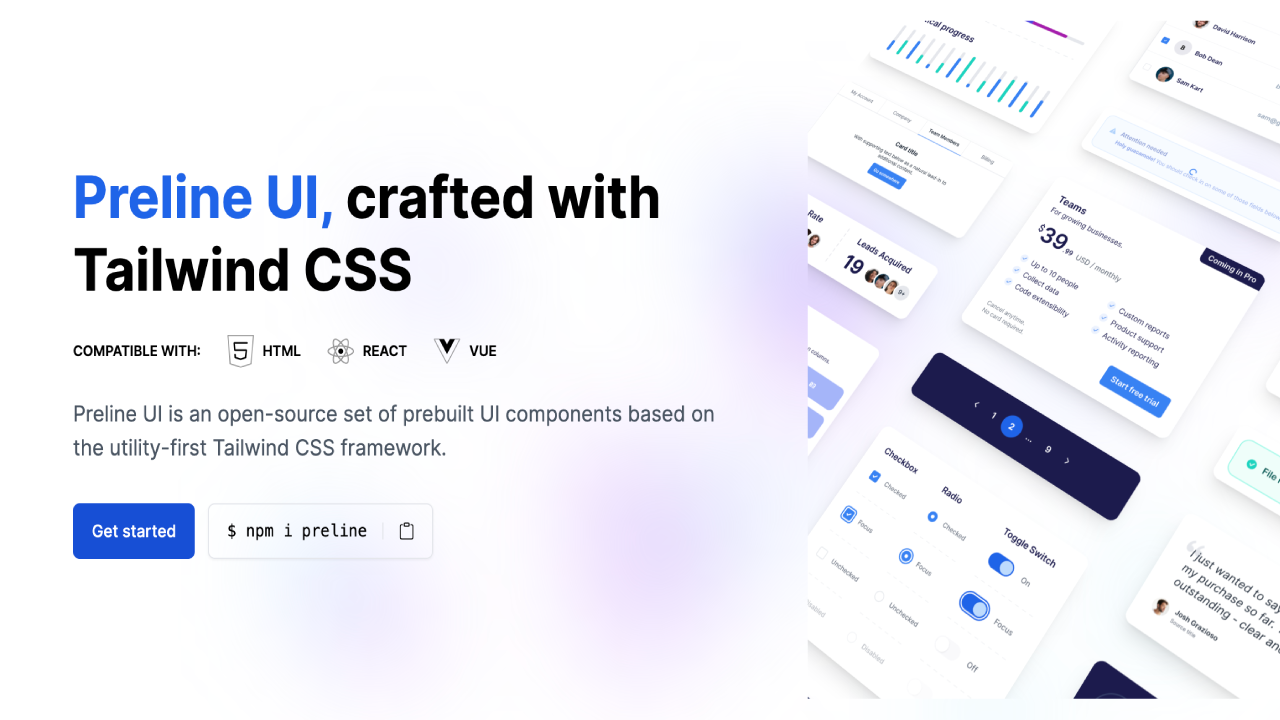
Preline UI is a robust, open-source Tailwind CSS toolkit and component library. Offering seamless integration, it provides a vast array of components for HTML, React, and Vue projects.
About the kit
Preline UI boasts an impressive gallery of over 300 component examples, providing a comprehensive collection of accessible and customizable UI elements to cater to all your website development needs. These components can easily be integrated into React, Vue, and HTML projects, with optional JavaScript plugins available to bring your Tailwind CSS creations to life.
Not only does Preline UI offer a stunning light mode, but it also includes a dark mode variant for all components, allowing you to effortlessly style your website to cater to users who prefer a darker interface.
Best of all, all of these fantastic features and components are open-source and available completely free of charge!
In addition to the extensive range of components, Preline UI also provides starter pages and examples, allowing you to quickly develop your project using pre-built UI parts, custom components, and layouts based on Tailwind CSS. Examples include:
- Accordion (7 components)
- Alerts (8 components)
- Avatar (10 components)
- Avatar Group (4 components)
- Badge (9 components)
- Blockquote (9 components)
- Buttons (13 components)
- Button Group (4 components)
- Card (21 components)
- Collapse (1 component)
- Devices (2 components)
- List Group (9 components)
...and many more!
For design enthusiasts, the toolkit also includes Preline UI Figma; the largest free design system for Figma, crafted using Tailwind CSS styles and Preline UI components with extra top-notch additions. You can explore the Preline UI Figma design system here.
